RSS

Great ear buds backed by an even greater company

Published on 03/05/13

I’ve been working from home for almost 6 years, and I’ve come to rely on in-ear ear buds to help cancel out background noise (i.e. homeschooled kids, dogs, etc.) when I am able to and I need to concentrate.

I’ve gone through many sets of earbuds over the years, with varying degrees of success. The primary problem is failure after three months or so. My earbuds are used constantly; they are always either in my ears or in my pocket, day and night (I usually fall asleep listening to podcasts).

I was almost to the point of shelling out $80 for Apple earbuds just because I knew they had a 1-year warranty. They would at least last a year. I learned about Tweaked Audio while listening to The Morning Stream and found out they had a lifetime warranty so I thought I would try them out.

The sound quality is great. I’m not an audiophile, but they do a great job of rendering the highs and the base, and they do great at blocking out background noise (which is what I really need). The build quality is also phenomenal.

The really great thing though is the way Tweaked Audio stands behind their product. The simple fact is that earbuds, no matter the manufacturer, have tiny little wires that can fail. My Tweaked Audio buds have failed multiple times, but each time they dutifully send me a new pair. It was getting to the point where I was starting to feel a little guilty, but they are more embarrassed that their product caused any problem at all. In fact, this last time I got them replaced, I told them I was expecting to pay at some point. I mentioned my plans to buy my son a pair of Tweaked earbuds and they asked what kind he wanted, sending a pair for him along with my replacements, free of charge.

If you are looking for earbuds to replace your iPhone buds or whatever, you really can’t do better than Tweaked Audio

I entered a contest

Published on 10/28/12

I just finished entering Net-at-hand into the AWS Challenge. Amazon Web Services are pretty great, it’s what Net-at-hand runs on and has served me extremely well.

Each year they have a contest for startups that are, or will be, using Amazon Web Services to build their business on. I’ve been using them since 2007 and I thought I’d go ahead and enter the contest.

We’ll see what the Lord does.

Yet another logo redesign

Published on 10/25/12

This last July marked five years that an.idea has been in business. It’s been a great learning experience to grow a business and a reputation.

However, I’ve never liked my logo. I’ve got a few great logos under my belt that I am extremely happy with, but the logo for an.idea has never settled well with me.

The original idea of the logo was to show that an idea is the building block of all great products. Unfortunately, the logo looked pretty bad.

Original logo for an idea

It wasn’t until recently that I started started writing the company name as an.idea instead of just an idea. Adding the dot to it connotes what the company is all about, build great websites.

A couple weeks ago I played around with drawing my own logo type and came up with something that I think may actually stick this time. Here it is.

New logo for anidea

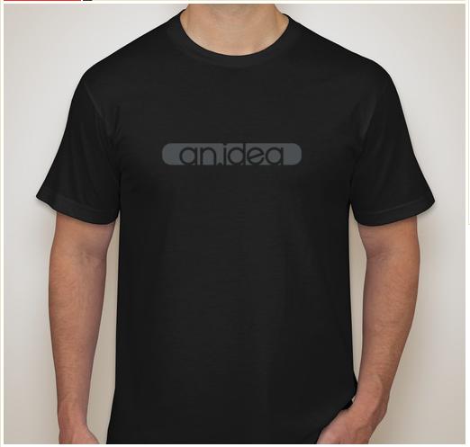
I also thought it would look pretty great on a black t-shirt (my uniform).

anidea tshirt

So now I get to redesign all the corporate stuff again. Maybe I’ll even do a business card that I am proud of.

Logo Type

Published on 10/15/12

This last week, Marco Arment created a new magazine for tech nerds called The Magazine. At first blush this looks to be a publication that I will be interested in. It will have 4-ish articles every two weeks written by some great technology writers.

I signed up for the trial and really enjoyed the writing.

I love the design of the app/magazine, but I do have a quibble with the kerning on the logotype for the magazine. Below is the unadjusted type pulled from a screenshot. If you look carefully, you’ll see that there is too much space between the “T” and “H” in “THE” and also too much space between “M” and “A” in “MAGAZINE”.

Logo for THE MAGAZINE

I pulled the logo into photoshop and quickly fixed them by moving the “H” and “A” over a pixel or two. This is what I ended up with:

Suggested logo for THE MAGAZINE


I hate to bring this up in a post about a minor suggestion for a publication I enjoy, but the typography in the logo for my bank makes me sick. I’ve been wanting to complain about it on my blog for awhile. Not only does it have bad kerning between the “R” and “E”, but the small caps are just scaled down copies of the all caps. True small caps are redrawn so there is a consistent weight between capital letters and small-cap letters. By scaling the type instead of redrawing it they’ve made the small-caps much thinner instead of just smaller.

Regions Logo

An afternoon’s work, guys, is all it would have taken to have a logo with nice typography. Now you’ve got you’re laziness plastered on signs all over the southeast.

By the way, if any of my fellow type nerds can help me identify the font used in the logo. I’d appreciate it. I know the “R” from somewhere, but I can’t quite place it.

My thoughts about CSS hacks for IE

Published on 05/24/12

This will be short but sweet. I don’t like using conditional comments to target IE. I like to keep my markup as clean as possible. Why would I want to put stuff in my content to cater to a browser that is broken?

I’ve recently discovered to CSS hacks that let me target IE 7 only and IE 7 & 8 only.

To target IE 7 only just put an asterisc in front of the property you are editing:

*width: 96%
*padding: 2%

To target IE 7 & 8 only put a ”\9” at the end of the property you are editing just before the simicolon:

width: 96%\9;
padding: 2%\9;

Neither one of these are valid CSS, but IE recognizes them as such so you can send properties to those browsers specifically to try to fix some of the things that are broken (or alleviate the pain a bit).

My reasoning for this is simple, content (HTML) is all about communication. I want it to be simple, clear, and clean. I don’t even like putting comments in my HTML that are meant for people who look at the HTML source. CSS, on the otherhand, is all about getting down and dirty with specific browsers. We are trying to force browsers to make our content look a certain way. I don’t care what I do in the CSS as long as it works.

Using a bug in IE to work around other bugs is fine by me.

My recent switch to git from svn

Published on 05/24/12

For the last several years I have been using a version control system for all my work files, and by work files I mean everything, not just code. All my design files, layouts, Photoshop documents, and everything else gets committed to a repository of some sort so I am always able to keep track of all the changes that are made to a document. Everything I submit a mockup to a client the changes are committed so I can always get back to that point no matter what. I don’t have to save multiple versions of the design in order to have this complete history.

It also, even more importantly, saves me from myself when I make stupid mistakes—as in getting a file that was buried in a folder that you thought only had unimportant stuff and got thrown away but you really ended up needing it.

If you are a designer, I highly recommend some sort of version control system. It is great (though it can be a little difficult to figure out if you aren’t also a developer).
read more

A new site

Published on 05/16/12

I am in the middle of starting up a new website that will be focused on getting web design leads here in the Pensacola area.

I’ve never really had to go out and actively look for leads. I can’t really think of any times since I started freelancing 5 years ago that I have had to look for work. As a reault (I think) most all of my clients have come from outside the Pensacola area.

This has worked really well for me because I think much more clearly when I am communicating via email than when I am sitting in a meeting with someone.

So my new little site entitled Web Design in Pensacola is going to be all about selling my design services to potential leads; trying to get them to call or contact me. I am planning on doing some small AdWords campaigns targeting “pensacola web design” just to try to drum up some business and see how it goes. It will also help me gauge how much a website’s flashiness converts into leads. I generally try to keep things simple just so communication is unencumbered. So the website will start out simple, but if it doesn’t drum up any business, then I can work on flashing it up a bit (animations).