This last July marked five years that an.idea has been in business. It’s been a great learning experience to grow a business and a reputation.
However, I’ve never liked my logo. I’ve got a few great logos under my belt that I am extremely happy with, but the logo for an.idea has never settled well with me.
The original idea of the logo was to show that an idea is the building block of all great products. Unfortunately, the logo looked pretty bad.

It wasn’t until recently that I started started writing the company name as an.idea instead of just an idea. Adding the dot to it connotes what the company is all about, build great websites.
A couple weeks ago I played around with drawing my own logo type and came up with something that I think may actually stick this time. Here it is.

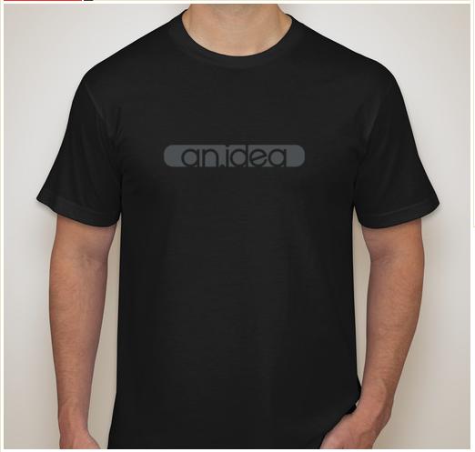
I also thought it would look pretty great on a black t-shirt (my uniform).
So now I get to redesign all the corporate stuff again. Maybe I’ll even do a business card that I am proud of.